Floorplan Editor
Description
Year
2026
Skillset
User Research
Visual Design
UX/UI
Validation Testing
Product Management
Visual Design
UX/UI
Validation Testing
Product Management
Role
Product Lead
Link
www.poly.cam
Background
AI generated floor plans are Polycam's second most used tool, with 3,000+ scans processed daily. However, inaccurately detected walls, openings, and furniture were frequently observed with no way to fix them.
With 3,047 support tickets referencing this issue, editing floorplans was the clearest unmet need in the product.
With 3,047 support tickets referencing this issue, editing floorplans was the clearest unmet need in the product.
What I did
I led the product strategy, design, and launch of this 0-1 feature, and shipped for mobile and desktop in 5 months with a team of 3 engineers. The closed beta generated a 700+ user waitlist within 24 hours and drove $600k in new subscriptions in the first week, the most successful launch in Polycam's history.
●
Designing an Editor 0-1
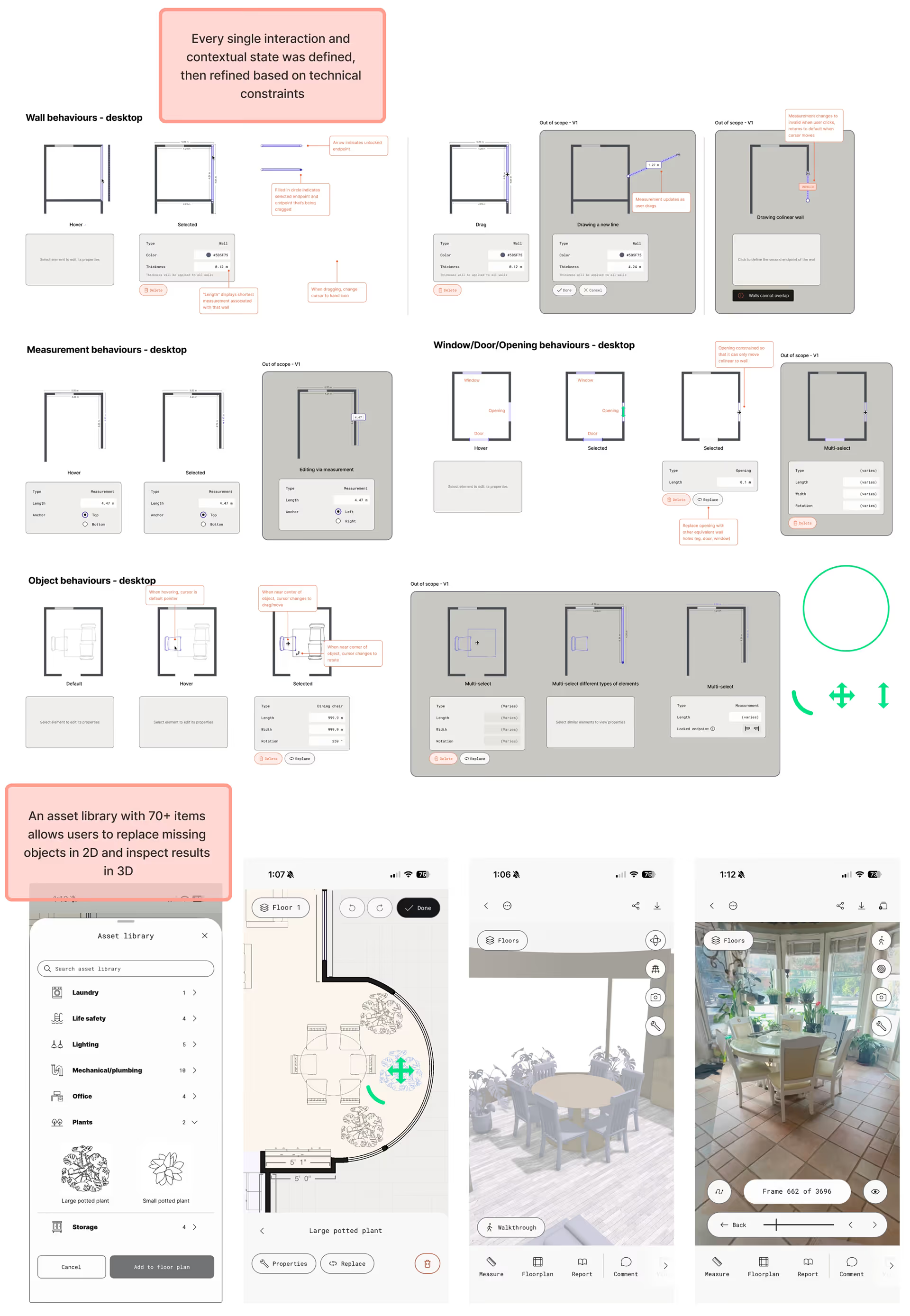
Keeping human in the loop
The core design challenge was making the editor work on mobile and desktop. I designed a contextual panel that surfaces all available actions only when an element is selected, a pattern that would work across both surfaces. This decision reduced engineering complexity significantly because we built one system instead of two.
●
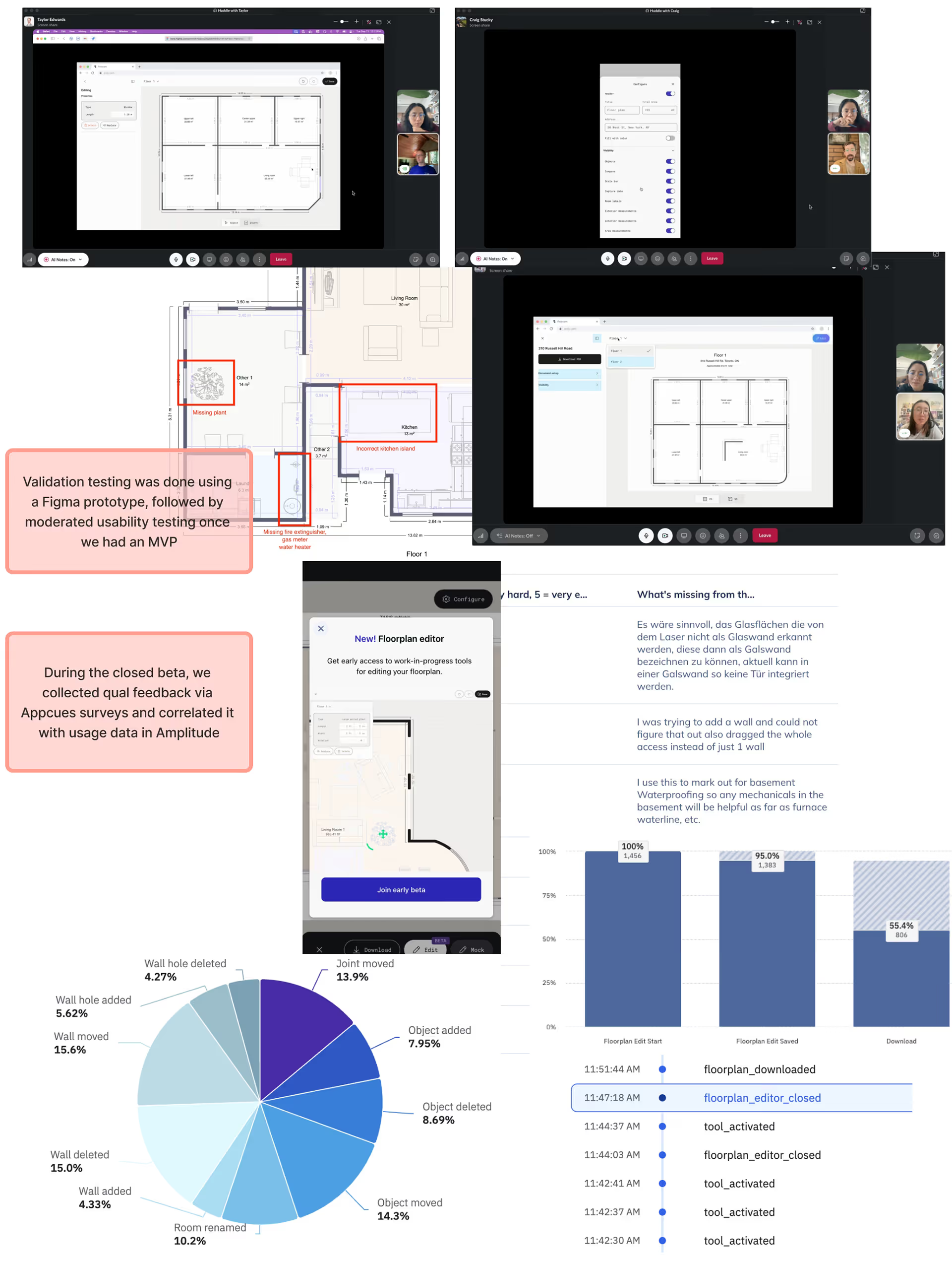
Closed Beta
9 weeks, 418 users, 18,265 edits
I designed the full feedback loop to capture usage and sentiment data for the initial launch with a goal of identifying usability problems and feature gaps. 59% of beta testers rated usability 5 out of 5, a signal that the core interaction model was sound.
The clearest points of friction centered around a lack of real world references, and additional annotation features, findings that directly shaped V2 priorities.

More Work